Assisted suicide is a very controversial issue and often leads to misinformation and biased responses. It can be difficult to find a graph or chart that has accurate information regarding this topic. In order to find graphs that are not highly biased or inaccurate, you have to do research and use your knowledge of what an accurate graph would include to determine if you should use the graph for informational purposes.

This is a graph about how many people have have acted upon Oregon's law that allowed medically-assisted suicide since it was passed. The first thing I noticed about this graph was the title, 'Assisted suicide deaths'. It just doesn't seem like the best title for what the graph is talking about. The x and y axis are not labeled, which can be misleading and confusing. You can infer that the x axis is about the year and that y axis is the number of individuals who acted upon the law. This graph does not seem to be too reliable.
There are many graphs out there that are misleading and do not provide accurate information. You have to be diligent in making sure it comes from a reputable source and that the information shown is accurate. It can definitely be frustrating in locating the graph that actually has good information on it. There are graphs out there with good data, you just have to know where to look and what to look for in determining the accuracy of them.
Hey Amber!
ReplyDeleteI really liked your post and how you organized it. I also liked how you chose to do it on one particular topic. In the first graph, it is pretty obvious how to read the graph but I do agree with you that there needs to be titles for the X and Y axis.
P.S- I love your background:)
Hello Amber!
ReplyDeleteI love how you begin the post say that it is important to know the facts before reading and understand whether or not the graph is accurate. also great job analyzing the graphs.
- Rachel Lanier
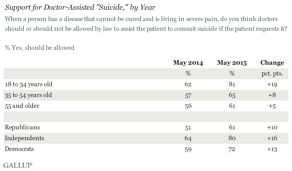
The top graph is actually not that bad, although you're right that it's missing the axes label. The title could be made a bit more descriptive, but I suspect it was left short so it would be more catchy in the news story it was a part of. There are a ton of graphs about assisted suicide, so you wont have a problem finding good ones for your project. Check out the Public Perceptions ones via Gallup (eg. http://news.gallup.com/poll/162815/support-euthanasia-hinges-described.aspx) or Pew Research. There are also a lot put out by the CDC and the US HHS. Check out this one for bad data: http://news.gallup.com/poll/162815/support-euthanasia-hinges-described.aspx
ReplyDelete